


Transportation agencies often need to assess whether traffic conditions have improved, worsened, or stayed the same following changes like signal retiming, construction projects, or seasonal events. But making that comparison has traditionally required pulling multiple reports, exporting raw data, and doing manual analysis in Excel.
That’s why INRIX developed Comparison Mode — a powerful new feature in INRIX Signal Analytics that allows users to compare two time periods and clearly visualize how corridor performance has changed over time.
In this blog, we’ll walk through how to use Comparison Mode to uncover insights, validate interventions, and tell a clear story with your corridor performance data.
What Is Comparison Mode?
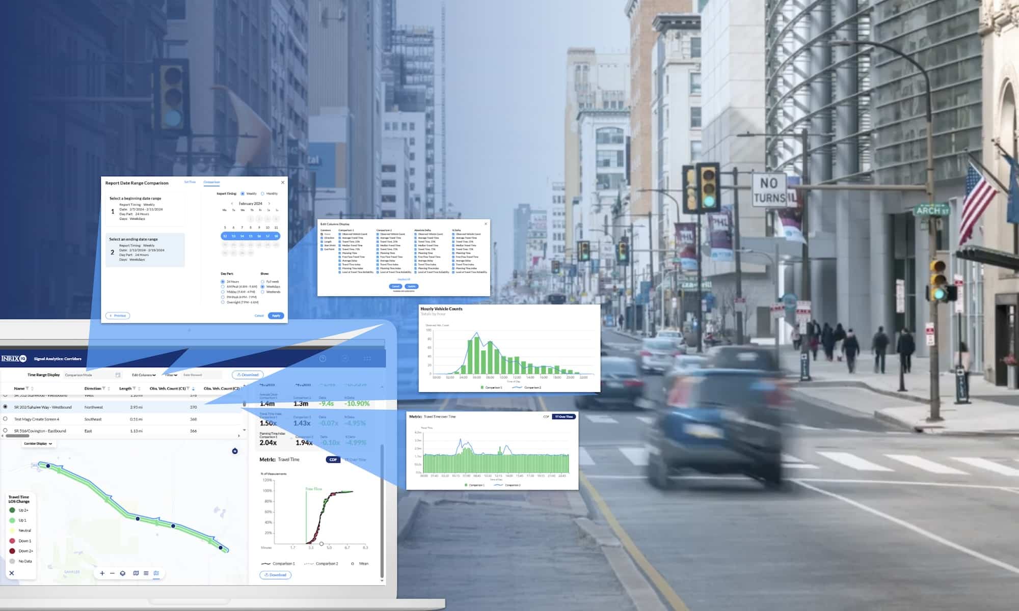
Comparison Mode is a new feature in INRIX Signal Analytics that enables transportation professionals to easily compare the performance of a corridor or intersection across any two user-defined timeframes—from a single day to an entire year. Whether you’re evaluating before-and-after signal timing changes or assessing seasonal or event-related impacts, you can now do it directly within Signal Analytics.
Users can choose from a wide range of metrics like:
- Observed Vehicle Counts
- Median Travel Time (and 25th / 75th Percentiles)
- Average Delay
- Planning Time Index
- Travel Time Index
- Level of Travel Time Reliability (LOTTR)
Each metric can be displayed as an absolute delta and/or percentage delta, helping you clearly identify whether conditions improved or worsened—and by how much.
The feature includes:
- A split-view table to show all selected metrics (e.g. travel time, delay, LOTTR) with observed values, absolute deltas, and percentage deltas.
- A color-coded interactive map to visually identify which corridors or intersections got better or worse.
- The ability to download all comparison results and charts, including metrics for each period and their deltas, for easy reporting or internal documentation.
Best of all, Comparison Mode is built right into the existing Signal Analytics workflow—no extra tools, no extra exports, and no new systems to learn.
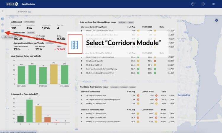
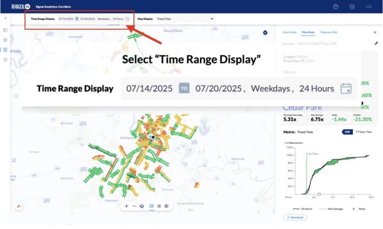
Step 1: Navigate to the Corridor Module and Enable Comparison Mode
From the INRIX Signal Analytics dashboard:
- Select the Corridor Module from the left panel navigation bar.
- At the top of the screen, select the Time Range Display
- Open the standard time range selection menu to begin setting up your comparison.
This will bring you into the dedicated workflow for selecting two time periods to compare
Step 2: Choose Two Time Periods to Compare
You’ll now choose two time periods for comparison:
- Define Your First Time Period: Set your baseline period, then click Next.
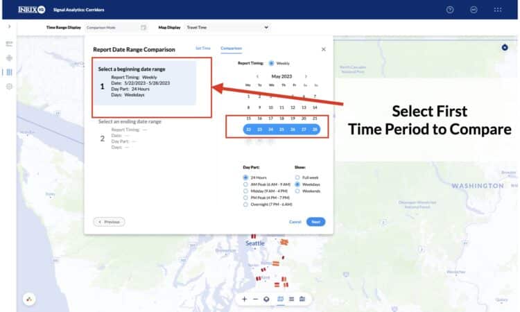
- Select Second Time Period: Choose your comparison period and click Apply. All results will now reflect the two selected time periods.
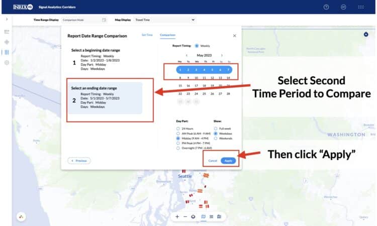
You can compare a wide variety of date ranges:
- A weekday vs. a weekend
- A specific event week vs. a non-event week
- One full month vs. a single day
- Or any other saved time periods—regardless of their length
This flexibility supports everything from short-term interventions to long-term planning evaluations.
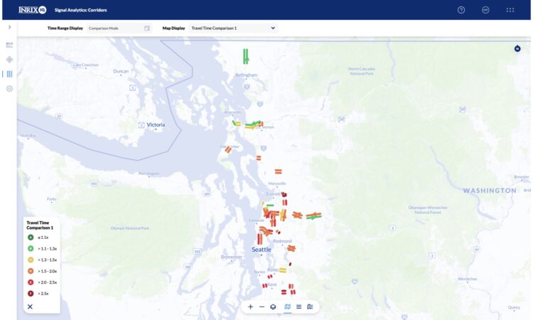
Step 3: Use the Interactive Map for Quick Visual Insights
Once your time periods are set, the main corridor map updates automatically. Use the Map Display dropdown to toggle between:
- Comparison 1 (the baseline period)
- Comparison 2 (the reference period)
- Change View (the delta between the two)
In Change View, corridors are color-coded to quickly visualize performance shifts:
- Green for improvements
- Red for degradations
Step 4: Explore the Split View Table
Click into Split View or List View to analyze side-by-side data for each selected corridor. These tables show:
- All available metrics for both time periods
- Absolute Delta and % Delta values
- Color-coded indicators for performance shifts
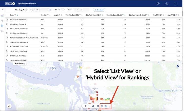
You can sort, filter, or rank corridors by any delta metric (e.g., largest increase in delay or largest decrease in vehicle counts). This helps you focus on the most meaningful changes.
You can:
- Filter by specific metric types (e.g., Travel Time Index only)
Sort by highest/lowest deltas - Focus on the corridors with the most meaningful change
This table is your go-to view for quickly understanding where and how performance changed.
Step 5: Dive Deeper Into Individual Corridors
Clicking on a corridor row in the table will open a detailed comparison plot showing performance trends across the selected time periods for that specific corridor. This view allows you to:
- See time-of-day patterns and trends
- Understand when conditions improved or worsened
- Pinpoint issues tied to specific peak periods (e.g., morning or evening rush)
These plots help you back up your findings with clear evidence and prepare for stakeholder discussions or internal debriefs.
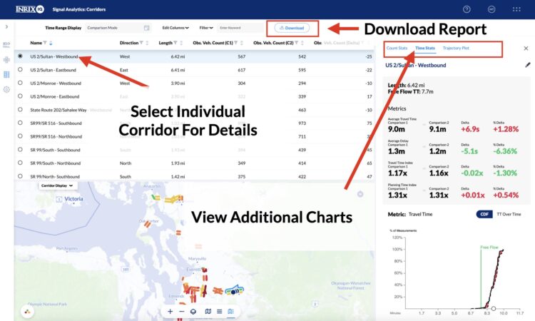
Step 6: Download and Share Your Results
Once you’ve completed your analysis:
- Use the Download button to export the data/full report.
- The export includes both time periods, all metric deltas, and summary tables.
- It’s formatted for easy integration into memos, presentations, or reports to leadership.
Whether you’re reporting to city council, applying for grants, or justifying budget requests, having this data in a digestible format makes it easy to communicate your results with confidence.
Use Cases: Corridor and Intersection Module
With support in the Corridor Module today and the Intersection Module coming soon, the possibilities for impact analysis are wide-ranging.
- Measure the effect of signal retiming along an arterial
- Compare traffic conditions before and after construction
- Understand how game days or school calendars affect flow
- Evaluate network-wide performance for grant justification or performance-based budgeting
- And many more!
See Comparison Mode in Action- Join Webinar
Want to learn more? Join our upcoming webinar to get a firsthand look at Comparison Mode and hear from transportation experts on how performance metrics are being used around the world.
Unlocking the Power of Traffic Signal Performance Measures
August 7, 2025 | 10:00 AM PT / 1:00 PM ET