


Mark Twain’s quote “history doesn’t repeat itself, but it often rhymes” is an apt description for what we have done this week. In 2008, we leveraged big data to take congestion analysis to a new level. Building on the trail blazed by TTI’s Urban Mobility Report and other industry leaders, we published the INRIX National Traffic Scorecard, the first national assessment of traffic congestion at granular day, time, road segment levels.
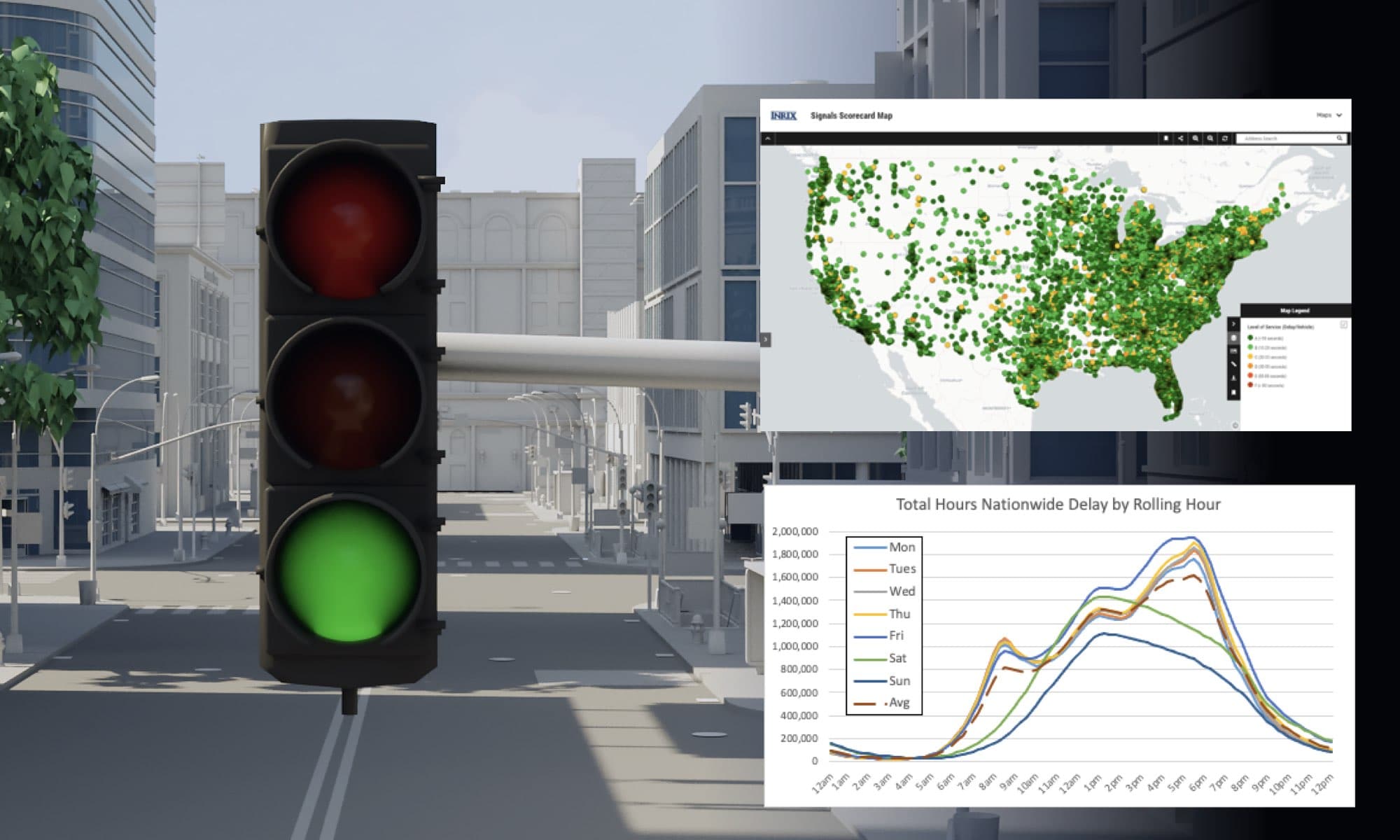
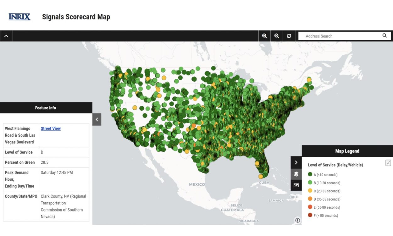
In 2021, we are breaking new ground again. Building on the work of Purdue, the FHWA, leading agencies, and professionals involved in developing traffic signal performance measures,[1] we are leveraging big data to provide the first national-level assessment of traffic signal performance. The INRIX U.S. Signals Scorecard provides the first systemic nationwide analysis and summary of all movements at more than 210,000 signalized intersections across the country.
INRIX IQ Signal Analytics, a service provided in partnership with the University of Maryland’s CATT Laboratory, generated the data analyzed in the Scorecard. Using a week’s worth of traffic light data from October 4-10, 2020 – chosen as a ‘typical’ week nationally in 2020 in the new ‘Pandemic’ paradigm – the Scorecard provides the first national benchmarking of key traffic signal performance measures, namely delay per vehicle (‘Level of Service’) and percent of vehicles arriving on green. While not all nationwide signalized intersections are included in this report,[2] this is by far the most comprehensive report to date. Leveraging nearly 1 billion observed crossings over the week to directly measure the performance of roughly 2/3rds of all signals in the United States, the Scorecard’s data and conclusions are representative of overall national, state, county and metropolitan area performance.
The Scorecard describes the methodology used to generate results and findings. At a high-level, a critical mass of connected vehicles providing accurate location updates every 5 seconds or less were analyzed as they move through the road network. Interactions with known/mapped signalized intersections (we call ‘observed crossings’) are logged, and performance metrics are calculated and aggregated in 15 minute increments.
National Results and Findings of Traffic Signal Data
Daily nationwide average statistics are shown in the figure below. We expect to continue analyzing the traffic light data and share noteworthy findings in future blog posts and presentations. In my initial analysis, two key findings stand out (each are discussed in more detail in the Scorecard):
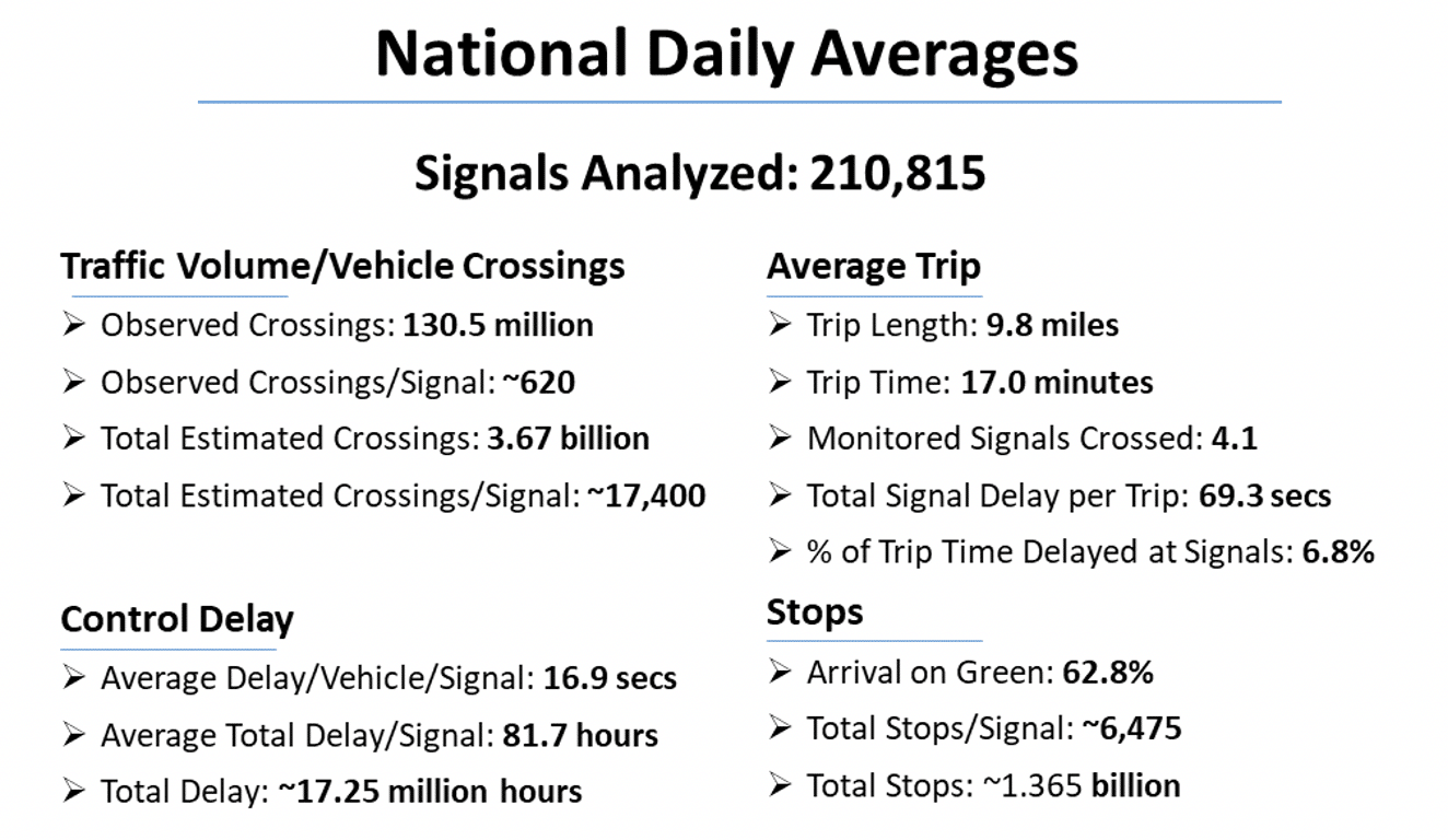
- Traffic signals contribute more to overall network delay than previously thought: Ongoing research is updating the infamous ‘causes of congestion’ pie chart to increase the overall impact of signals to network delay. The Scorecard results are consistent with these new findings, with a reasonable overall estimate of 10% of total time of the random trip (day, time, location, type) being stopped at or slowed by signalized intersections.
- Midday now more important than the AM peak: Overall demand increases and performance decreases on weekday and Saturday midday as compared to AM weekday peak. Anecdotally, morning traffic volumes have been most affected by pandemic-related travel pattern changes. As we evolve to the ‘new normal’ it could be that the AM peak is permanently impacted and its importance in overall traffic signal performance diminishes.
Analysis of Intersection Level Details
While the Scorecard aggregates results nationally, by state, by county, and by metropolitan area, detailed results for all signalized intersections for the week were used. The scorecard highlights only a handful of these, listing the week’s 25 poorest performing intersections in metropolitan areas in terms of Delay/Vehicle (Level of Service) and Arrival on Green percentage. The scorecard reflects performance for the 24-hour period, our traffic signal software provides the ability to examine peak periods and custom date ranges. To expose details for all traffic signals analyzed, we created an online map here.
When reviewing intersection level details, context is always important. Many on the list are likely there due to either challenging geometric considerations or temporary reasons. Examples:
-
- The intersection with the most delay per vehicle, north of Ft. Worth, Texas, is immediately adjacent to an at-grade crossing of a busy railroad line.
- Many of the signals with low arrival on green percentages are intersections more complicated than the standard 4-way intersection, meaning there are many more movements/phases making it by definition harder to provide green time to any particular movement.
- The busiest non-urban intersections were multiple intersections in Tennessee due to the Smoky Mountains Harvest Festival.
Visit inrix.com/products/signal-analytics/ to learn more!
[1] https://ops.fhwa.dot.gov/arterial_mgmt/performance_measures.htm
[2] Industry experts believe there are over 300,000 signalized intersections in the US. The Institute of Transportation Engineers estimated in 2018 there were 327,860 signals: https://www.tsbenchmarking.org/wp-content/uploads/2020/03/TSBSOPR-Final-Report-NOCoE-ITE.pdf